Slide 1
Hello everyone!
Slide 2
My main interests relating to illustration are in picture books, historical and/or theatrical subject matter, and by hidden visual narratives I mean imagery that you can look further into and notice things that may be going on in the background of a story - in the detail.
Slide 3
My aims before starting University were to utilise my creative skills so that I could work on professional projects and earn money from doing something I love. Working with like-minded people was something I was very excited about which is why I chose an Art specific Uni.
Slide 4
Wordless narrative is a big aspect of my practice and what I based my COP project on. I'm really interested in the link between words and images.
Slide 5
Example from my COP project. I showed people the image of a scene and asked them questions about what could have just happened, or what might happen next. From these answers I designed a character and wrote short stories. I wanted to demonstrate text coming from imagery, rather than imagery coming from a text. This is something I am really interested in and try to think about when creating imagery.
Slide 6
Scenes are a main aspect of my practice, which is something I realised during my COP project. It helped me a lot to define these aspects as I could then think about them individually, so within a scene I could think about how to create depth and make the best use of composition.
Slide 7
More from the Wizard of Oz.
Slide 8
I have realised that research is very important to me. I want to make sure that if I'm working with a particular subject matter that the details are correct. I also really enjoy research as this is when I start to get ideas. This is where a lot of my inspiration comes from.
Slide 9
I have always been a bit scared of character design because I didn't think I could do it. This year, because I have embraced the fact that I enjoy children's picture books, I can be a bit more playful and try out different ways of drawing people.
Slide 10
As you can see here - at the start of this year I tended to use just shapes and rarely experimented with features or expression. This is something I have been working on. They are both the same sort of idea and subject matter, but I definitely thought more about potential narrative and tone in the newer one.
Slide 11
Another project that allowed me to think about character was this one. I looked at women throughout history and developed each one into a singular image. I started to think about the historical setting in relation to modern technology, which is an idea I really like and one I might continue with - picture book?
Slide 12
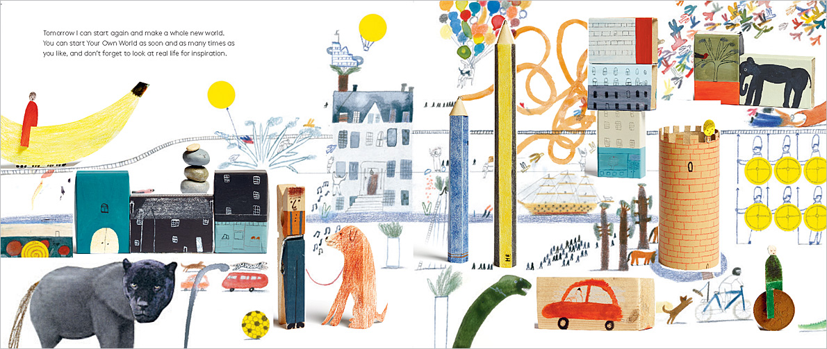
Linking to what I said before, I am really enjoying the process of thinking about a whole world when designing a character or scene. I want them to feel as though they could exist outside of the image.
Slide 13 &14
Whilst making book proposals I noticed how useful roughing actually is. It has always been an important part of my process but this year I really thought about the book as a whole and how I could use more dynamic compositions to keep a reader's interest.
Slide 15
One of the most exciting things for me this year was having my work published after I won a competition for the Stratford Literary Festival. I really enjoyed the brief and it was slightly different to what I usually do - hand written type and more colourful.
Slide 16 & 17
Another competition I entered again this year was the Folio Society Book Illustration Competition. I found it a lot more difficult this time round as I had to consider a darker tone. This was the when I started to think about lighting. Last year I think I was long-listed because my work was intricate and delicate which works well for Jane Austen. This year I was much more out of my comfort zone.
Slide 18
These are the binding designs for this year and last year's submission. As you can see I went for a similar design on both. I actually really like working with the graphic shapes, which is something I don't do often. Lighting has become something I use a lot now to describe atmosphere and I thought I could use this effectively with a bold cover too!
Slide 19
What I'm working on at the moment! My design was chosen for the Left Bank Opera Festival's promotional material. I was really excited to get this commission because I love theatre and performance and want to do more work in this area. I had a meeting with the art director who was very keen to help me! He wants to put a feature on me and my practice in the programme for the event, which is a great opportunity to get some publicity!
Slide 20
Different applications, seeing what a working relationship is like! Potential for more work.
Slide 21
I feel a lot more like an illustrator and less of a student now. Exciting to work wherever I want and on projects I enjoy! I will miss the comradery of Uni.
Slide 22
Thanks for listening! Good luck guys.
Sunday 20 May 2018
Saturday 19 May 2018
Thursday 17 May 2018
Business Cards

Mock-up
Before the final show, and for the Opera Festival, I wanted to have some business cards printed to give out to people who see my work, or just have a chat with. Using one of my Jungle Book images, I wanted to show that I enjoy working with tone and narrative, but not overcomplicate the design. I took the corner of my illustration and added my handwritten name header I use across my social media platforms and on my website. I kept the back of the card really simple with just a tag line and some details on there.
I have ordered cards to be delivered before the final show!

Front

Back
Wednesday 16 May 2018

After getting some recognition for my work on twitter, I thought it would be a good idea to make a profile! Before now, I thought it was a bit pointless to join twitter but I think in a professional setting it could be a good way of networking and getting my name out there.
Author - Description of my Work
'I really like your work. It has a melancholic feel with a bold yet dreamlike quality. It reminds me eastern European animations that used to pop up on channel 4 when I was a kid and the stop frame Moomins series. The colour palette you use is soothing yet grabs attention and there is a stillness of action, or an action of stillness, in your pictures. There is the time of energy potential. I like the detail and the depth but at the same time it's simplistic and in the foreground.'
An author I am working with on a picture book emailed me a great description of my work amongst our conversation about tone. It's so interesting to see how people interpret my illustrations. To me, my practice is a combination all the things I enjoy and am interested in, but aesthetically it's difficult to pinpoint the foundation of its development.
Getting external input and feedback on my work is helpful to me because it helps me to visualise something from another person's point of view. Often I feel as though I'm looking at my own work for too long and it's difficult to take a step back. This is especially important when collaborating on a project.
Getting external input and feedback on my work is helpful to me because it helps me to visualise something from another person's point of view. Often I feel as though I'm looking at my own work for too long and it's difficult to take a step back. This is especially important when collaborating on a project.
Thursday 10 May 2018
Creative Manifesto
Sophia Watts is an illustrator from Nottingham, currently based in Leeds/UK. She is about to graduate from Leeds Arts University with a degree in Illustration.
Taking inspiration from historical or cultural references, she works mainly with colour, shape and texture to execute her ideas. Creating a visual narrative is an integral part of Sophia's practice and can usually be found within a single image, depicting moments within a story.
From a young age, children's book illustration is an area that Sophia has been fascinated with, and a field she enjoys working in. As well as publishing and editorial illustration, briefs of a theatrical nature have also always appealed to her. This interest which began outside of her creative practice has informed the way in which she makes images. Pacing a narrative, describing a tone/atmosphere, and including details of costume and scenery are all elements that are considered within Sophia's work.
For the Left Bank Opera Festival I had to send over a photograph and a biography for them to include in a feature on my practice that will be in the event programme. I already had basically a shorter version of this, but I feel that I know how to define my practice a bit more now!
For the Left Bank Opera Festival I had to send over a photograph and a biography for them to include in a feature on my practice that will be in the event programme. I already had basically a shorter version of this, but I feel that I know how to define my practice a bit more now!
Tuesday 8 May 2018
Publicity - Left Bank Opera Festival

Website Feature
The Northern Opera Group ran a feature about me on their website, including my updated biography and a link to my website.


Twitter Promotion
My first of three designs for the opera festival performances have been shared on social media, as well as an image of my face, which is a bit strange but it's nice to get recognition for my work!
Saturday 5 May 2018
Who I would like to invite to Hanbury Part 2
I have been thinking about who I would ideally like to discuss my work with at the next Hanbury Hall event. Last time I enjoyed the talks given by Big Active and Blink Art, it was interesting to hear about their working relationship. I would like to see them again, and also invite more publishers and people who could potentially give me work. The Artistic Director of the Northern Opera group expressed an interest in coming to the event, if he did so he could bring people with him.
Other people I would like to invite are -
Other people I would like to invite are -
- Walker Books UK
- Penguin Random House (ahead of my placement, maybe the Art Director?)
- Folio Society
- National Theatre
- CIA agency
- Heart agency
- Other illustration agencies
- Nobrow
Friday 4 May 2018
Laura Carlin
- What exists around you when you're younger.
- A lot of editorials come from America.
- Sketchbooks are important!
- Get rid of things that don't matter.
- Feeling inspired all the time is a myth.
- Importance of being playful.
- Don't just illustrate the text, think about what's not written - before and after.
- Don't worry about making a living from illustration right away.
- Survived without social media.
- Reality & Imagination are what makes kid's books good.
- See the book as a whole - roughs.
- Newspaper club - large format printing.
- Ceramics - telling a story around the room.
- Tile murals - multiple mediums.
- Bologna Book Fair - Italy.
Thursday 3 May 2018
Left Bank Opera Festival

Tuesday 1 May 2018
Stratford Literary Festival - Young Poets

I've been emailing Annie (Director of the Stratford Literary Festival) about my placement during the summer for Transworld Publishing (Penguin Random House) in London. She also added in the art director who I will be working with during my time there. I plan to take my portfolio with me to discuss with the art department, I want to make the most of this opportunity!

Saturday 28 April 2018
Print Stuff


Day trip to York
We had a day out to York to look around the Print Stuff fair and visit some of our pals who had work for sale. It was great to see such a range of work from practitioners of all ages and backgrounds. I noticed when walking around how different all the work was. Home-ware, ceramics, digital print and traditional print were some of the ways in which people had applied their work to sell.
Thursday 19 April 2018
London Trip - Galleries
Saatchi Gallery


What I love about the Saatchi gallery is the variations of different outlets of art that can be found. I am always drawn to the sculptural pieces as I admire the craftsmanship. This piece had such fine detailing and reminded me of a melting cake.
V&A Museum

One of my favourite parts of the V & A museum is the section where you can walk through rooms. What really struck me here is the intrinsic detail found within the décor. This room in particular was really fascinating to me. The entire room was created for the purpose of it being used as a music room. The gold patterns you can see on the walls are made up of instruments. This kind of detail is what I love to include in my work. At first glance it is not too noticeable, but requires the viewer to look a little deeper.
Saturday 17 March 2018
Adam Higton

During Adam Higton's talk, I admired how playful his work is. This is an aspect of my practice that I struggle with and although my work is very different to Adam's, I was able to think about how playing around with layouts could enhance the overall suggestion of 'fun', especially in children's books.
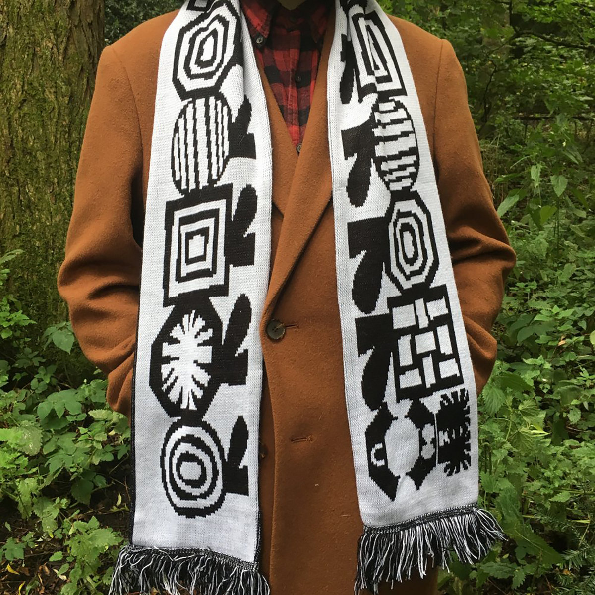
My favourite application of Adam's work was definitely on scarves. I like this design as it's not too obvious at first what it is. At closer inspection you realise its's a character that wraps around the entire thing. Here you can really see how the purpose has been utilised in the design.
Tuesday 13 March 2018
Children's Theatre Festival - Future Work
After contacting Little Feet Festival of Children's Theatre expressing my interest in working within their event, they contacted me saying that they would like to talk to me in a few months regarding the print for their show next spring. It won't be for a while yet, but making these lines of enquiry is very exciting for me! Especially within areas of theatre, as it's something I really enjoy outside of my practice. Bringing the two together would be an absolute dream for me!
Working with children is something I would like to do in the future. I did au pair work in Italy for the past two summers, but I'd like to somehow merge this with my practice - maybe by running workshops or encouraging children to make things!
Monday 12 February 2018
Manchester Art Gallery
On our visit to Manchester we took a visit to the art gallery. I always enjoy going to see more traditional galleries after being surrounded with illustration work for so long. Above are some of my favourite pieces of work. I found the ceramic pot really interested and unusual. The paintings I chose to photograph were the ones I admired the compositions and tone of. In particular, the images of people walking away from the viewer intrigued me the most. It's like they are leading you away on a journey.
Tuesday 30 January 2018
YOU ARE HERE - Hanbury Hall Event


The Day
We had the opportunity to interview lots of professionals from different sectors of the creative industries. It was also a great opportunity for our class to go on a trip together.
Big Active & Blink Art
- Opportunities to work outside of illustration - other disciplines.
- Trends - Magazines & Billboard Ads. Only 5% - less print based.
- Be aware of changes.
- Useful to have an agent to tell you - How do you get an agent?
- Art buyers - used to be just for print - changed. Digital too - more inter-disciplinary.
- Blink Productions.
- Do you hire illustrators to do animation?
- Work with people before signing them.
- What young people are interested in - trends.
- Having an individual style.
- Deeper level - emotional intelligence.
- Creative teams - ideas people.
- Possible collaboration opportunities.
- Blink industries - TV shows.
- Don't discount traditional means of communication.
- Blogs - itsnicethat
- Individuality.
- Weird visual references - personality into your work.
Anthropologie - Nicola
- URBN
- Detail
- Broad demographic - location.
Networking - Contact
I spoke to a few speakers during the event which was useful, but I got the most out of talking to some alumni in the pub afterwards. Dean and Angelika were really helpful and gave me an insight into what life after Uni is like and their journey to working for a children's publishing agency, 'Advocate Art'. I showed them some of my work on instagram and they advised me on who to talk to, and how to get an internship.
After we got back to Leeds, I contacted them again through instagram thanking them for the advice, and also got in contact with the people they had recommended to me. I sent some examples of my work and a statement about my practice to Advocate Art and they asked me to do an internship with them. At the moment I am very busy with Uni work and other things so I plan to do this after Uni at some point. They agreed that I could get in contact again when I knew I could take 2 weeks off. I am happy that I am starting to plan things for the future and give myself a variety of options.
Friday 26 January 2018
Printed Mini Concertina


I printed off around 20 of these books, which I then attached to covers, much like a normal concertina book. I like that I was able to include a sort of spine for each one, and I think the printing came out better as a single sided matte image than on the double sided printer.
Wednesday 24 January 2018
The Dots - Questions
Interviewing The Dots - Leanne Hammill
Intro
The Dots are an online networking site for creative people.
Questions
- Who are The Dots for?
- How did The Dots come about?
- How does The Dots work?
- What are the key things you should be thinking about when promoting yourself and your work? Especially the relationship between yourself as an individual and your work.
- Should the portfolio be specific to a specialist area, or is it better to show a variety of work?
- What do you personally look for in a portfolio, and what makes a successful portfolio?
- A lot of us here are studying illustration, you obviously work in the creative industries in a less traditional way, (than for example being a photographer or illustrator). What opportunities do you think there are for people who want to work more broadly within the creative industries? What was your journey to get to where you are?
- What is the best piece of advice you would give to a recent graduate in the creative industries?
Extras - other things to ask about?
- Releasing an app (new) - makes it more accessible to contact people and network on the go.
- Vibe of the brand - friendly yet professional. How to get this balance right?
Tuesday 23 January 2018
The Dots - Profile

Before Hanbury (where I am interviewing someone from The Dots) I thought it would be good to make a profile! Looking at how it is run, I think it's good that there's basically a linkedin for creative people. I will be adding more projects as I work the site out a bit more. There is also an option to search for job in the creative sector which could come in very handy also!
Final Concertina Design

Here is the final concertina design for the inside of the mini book. I had a lot of fun playing around with concepts - it was such a nice relief from the cop hand in to do something just for myself and not so pressurised by an imminent deadline.

Front & Back Covers
I thought about how to present the concertina for a while. I settled on creating a binding design, with the intention of making it look like a little book. I also wanted it to be held together somehow, as a loose concertina could be a pain to carry around with me. I am excited to see the final result of the printed copy!
Subscribe to:
Posts (Atom)