The images in this sketchbook are all from my time in Italy, I found that the things I enjoyed drawing the most were the architecture and people. Whilst there, I drew a collection of statues. I didn't want to focus much on materials as it was difficult to take paints etc with me when I was travelling to different places, pens and pencils seemed to be the best option for me. I used a lot of my evenings to go to different parts of the town and draw things I found interesting.
Monday 25 September 2017
Summer Sketchbook 1
Starting my summer sketchbook I drew quick imagery I saw around town. I started this before au pairing in Italy, where I found a lot of inspiration. I really enjoy reportage illustration when I visit places, but in second year I found that this fell to the wayside a little. It was nice to have the time to really just draw the things I wanted to, and ended up with a collection of drawings of the things I had seen over the summer. Drawing without the pressure of a deadline reminded me of why I chose to do an illustration course in the first place. I want to start being more free and experimental in the sketchbooks for my projects too.
Thursday 21 September 2017
Independent Leeds Feature - Taste Hunter

I finally got my hands on a physical copy of the new magazine! I really enjoy being a part of a local publication that brings together creators of all kinds, whether that's illustration, cooking, photography, etc.
Sunday 3 September 2017
Final Illustrations
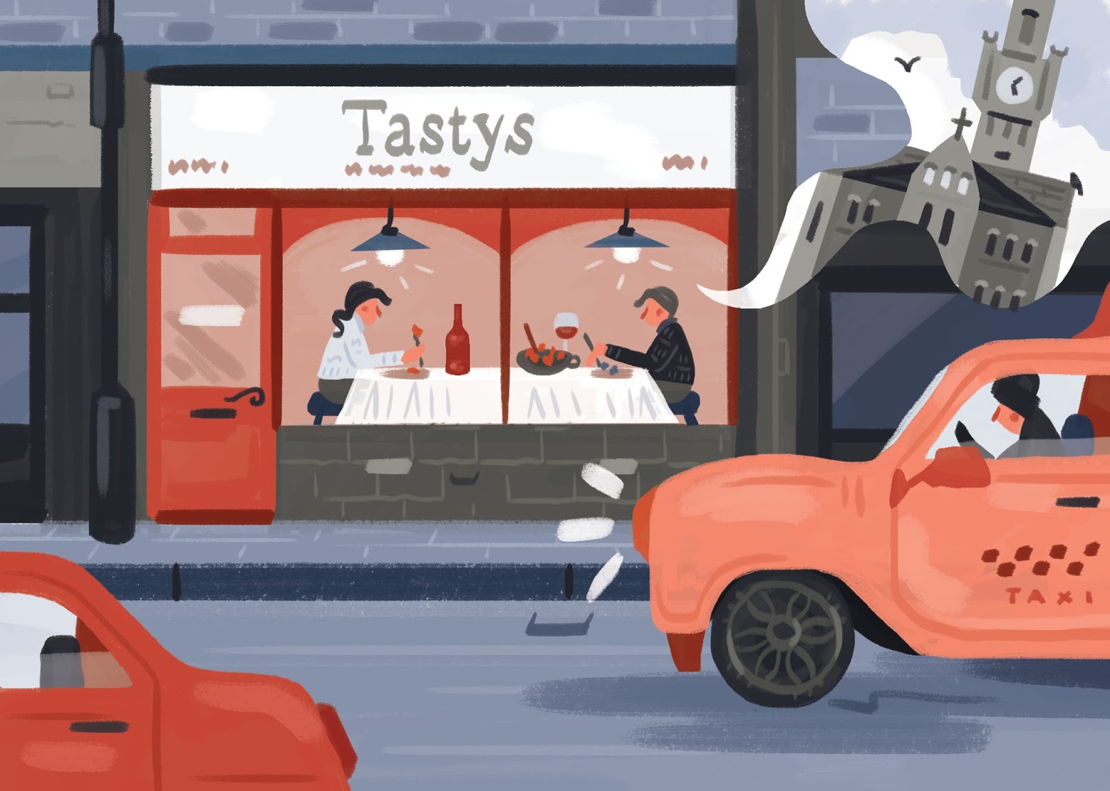
Main Illustration
I did this illustration much more quickly than the others as I had a bit more of a time constriction from when I was asked to complete the image, cramming in the leisure activities I already had planned, to the deadline. Overall I am happy with what I produced, however if I was to do it again I would change particular parts of the image.

Title Illustration
Again, this was a fairly simple image to create. I like the inclusion of the title in the circle, and apart from that it is fairly similar to the last title illustration I produced for the foraging article.
Saturday 2 September 2017
Development

Changes
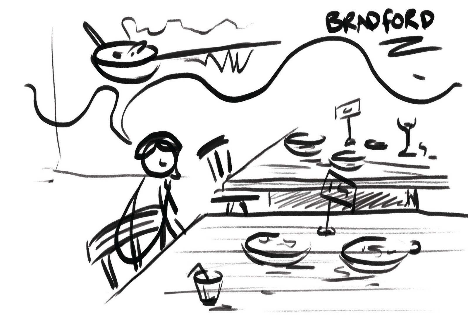
After completing the general shapes of the roughs I decided to make the taxi bigger in the frame, to be more of a central focus. I also changed the ratio of colours as I went along, thinking about the addition of people in the restaurant and a thought bubble describing the connotations of Bradford.
I also decided after starting my original idea for the header illustration that it was going to be too busy, because of this I added a plate with handles behind it and fewer items of food.

Colours

Colour Tests
I decided I wanted to select my colour scheme before starting work on the image, so I can just colour pick as I go along. As the subject matter is quite broad, about food, but also the actual restaurant, I didn't have a clue where to start.

Chosen Colour Scheme
I did a few variations of colour schemes, and eventually decided on one that contained pinks/blues. I think this was mainly due to my lack of time to develop something that was out of my comfort zone.

I decided to carry on with the colours I had chosen after testing out on the first part of my rough. I think I would have changed and tested out different colours if I had more time in the development stages.

Friday 1 September 2017
Final Rough

This is my final rough drawn out in Photoshop, I'm still not sure on what colours to use but I usually end up changing them as I go along. The details I will add in as I go along, at the moment I'm not sure how busy it will look. I have a few ideas but it's not realistic to use all of them in such a small frame. I am aware that I can get carried away with detail, so I'll make a conscious effort to not do this.
Roughs


Initial Ideas
I made a quick spider diagram of some of the key aspects to the article, that I may want to include in the final design. My initial roughs were based around the idea of the taxi, later developing on a few on the actual food and interior of the restaurant. I stepped away from interiors to not be too similar to the foraging article I illustrated right before this one.

Quick Digital Roughs
I played around with concepts on Photoshop to see if I could imagine how to compose my favourite ideas within the frame.

Subscribe to:
Posts (Atom)