
Showing posts with label OUIL502. Show all posts
Showing posts with label OUIL502. Show all posts
Monday, 15 May 2017
Sunday, 14 May 2017
Saturday, 13 May 2017
Life's a Pitch Presentation
The process of doing a presentation as a team was more difficult than I first anticipated, mainly because our work is all very different within the group. We all had publishing and other interests in music, sport, etc in common and me and Kat had experiences working with children so we decided to pitch a children's magazine similar to Anorak, basing each issue around a theme. The sections within the magazine would also be focused around a particular topic, for example we could have a historical page and a sports page. These things all link to the potential for children's art fairs and workshops. As a project this was a lot of fun to consider, the work we did around researching different magazines made me think about where ours could fit in. Although Anorak already exists, this is one of the only magazines that is aimed at children of both genders, whilst encouraging creativity.
A reason for our proposed magazine was to give an outlet to children to make things and still be creative, opposing and acknowledging the cuts regarding the funding of arts in schools. Promotion would include an on-line presence, art fairs, school/library visits and children's birthday parties. These things would all be inclusive of educational themes that we could pull from the national curriculum, hopefully making it a fun and exciting way for children to learn. Sports day style activities and music would also be a part of the activities available at events.
A reason for our proposed magazine was to give an outlet to children to make things and still be creative, opposing and acknowledging the cuts regarding the funding of arts in schools. Promotion would include an on-line presence, art fairs, school/library visits and children's birthday parties. These things would all be inclusive of educational themes that we could pull from the national curriculum, hopefully making it a fun and exciting way for children to learn. Sports day style activities and music would also be a part of the activities available at events.
Friday, 12 May 2017
Presentation Script Notes
So far I have general notes on what I want to talk about during my presentation. I won't actually be presenting until Thursday so I will refine and practice my delivery before then. Doing other presentations I have found that I don't tend to look at my notes too much, I think just for a back-up I like to have them in my hand and as I am more aware of time constraints this time round I may just make some flashcards to highlight each thing I want to talk about. Overall I feel okay about it, I am most worried about running over as I have quite a lot of slides. However, I am hoping to flick through them quite quickly as I explain my creative strategy and plans for next year.
Thursday, 11 May 2017
Saturday, 6 May 2017
Independent Leeds Feature


The new issue of Independent Leeds is out! It is such a nice feeling to have my work actually published in a magazine, and I am very pleased with the way it came out. I was a bit worried that the colours wouldn't look how I wanted but I am very happy with them! In the future I want to do briefs more like this one, as well as those for book publishing, because the content of the article aligned my interest with my practical work. I also enjoyed editorial because it is not as much of a huge task as making illustrations for a book. Also, the graphic layout is all taken care of - the only thing I had to deal with was the part of illustration that inspires and influences me the most.
Sunday, 2 April 2017
Finals

This is an image of the final pdf I sent to Independent Leeds. Overall I am happy with the outcome and I think it evokes the tone I was aiming for. As well as the colours, I wanted the focus of the illustration to be serenity - to go with the overarching themes of the article. Including the motifs of the sound waves is also something I really like in the image, I want to think about semiotics more in future projects as I think you can read much more into what is going on. I really enjoyed the process of this brief and it's the first proper editorial project I have taken on. As my practice develops I want to continue doing these kind of briefs, whilst developing my visual voice.
Circle Illustration


Tests
After roughing I knew the general idea I wanted to develop for the circle illustration. I tested variations of the colours I used in the half page image. The composition worked well against the other image, I think the balance of white and colour, as well as detail of the trees/leaves helped with this.

Final
I made the base of the mountain slightly thinner, to line up with the bottom part on the main image. I also just prefer the overall shape of the mountain in this one, it doesn't look as squashed down.
Tuesday, 28 March 2017
Half Page Illustration


Tests
I scanned my roughs in started working over the top of the ones that I thought would work the best. I wasn't sure on how much to include in the image, I definitely wanted a central figure but the actual scenery could have included a number of things, like trees, clouds, birds, rocks, animals, etc. Considering this, I started putting simple shapes in to the frame and gradually added elements til I felt I was happy with it. I also asked my pals at Uni about how much to include which helped me.
Monday, 27 March 2017
The Sound of Silence - Roughing Ideas
Half Page Illustration
My initial ideas around the theme of silence and meditation centred around sound waves. I liked the notion of including a sequential image within a larger scene to describe what it happening.

I wanted to include a single figure in the frame, I think this makes the article more personable. To start with, the roughs I drew out were focus on the face area which described the calmness of the character. However, after a bit of thought I realised that this may be a bit too simple. I also really like working with detail and scenery so I wanted to include that in there somewhere.


My initial ideas around the theme of silence and meditation centred around sound waves. I liked the notion of including a sequential image within a larger scene to describe what it happening.
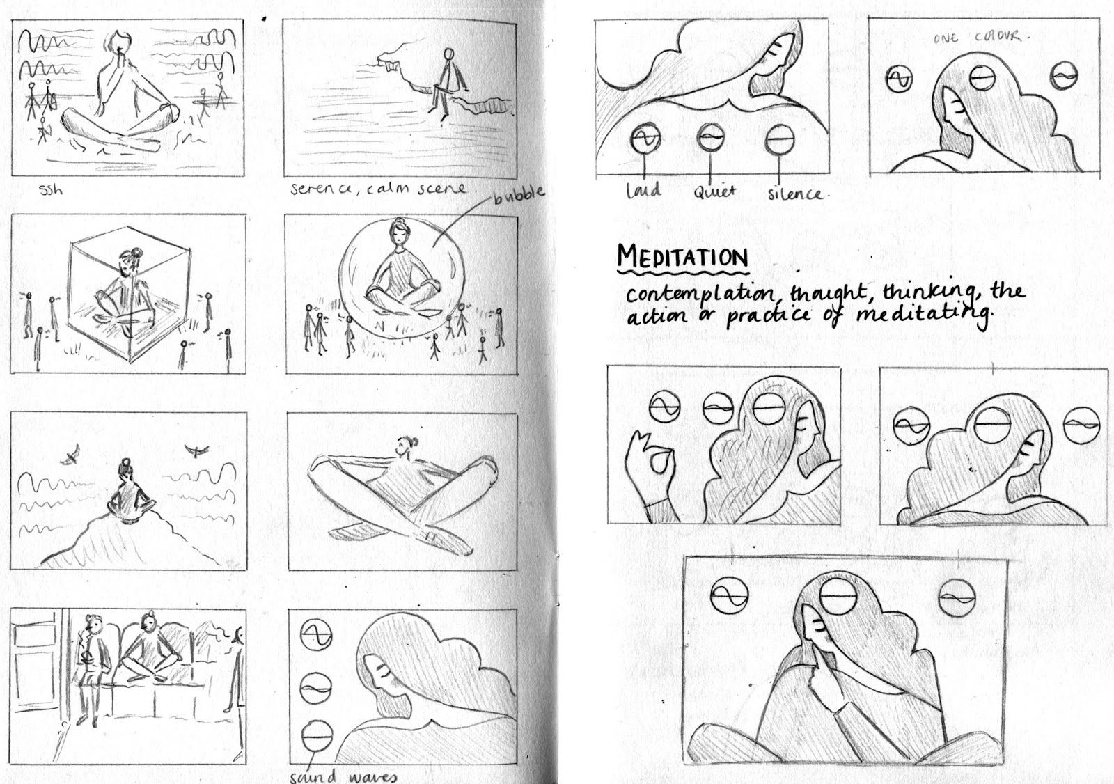
I wanted to include a single figure in the frame, I think this makes the article more personable. To start with, the roughs I drew out were focus on the face area which described the calmness of the character. However, after a bit of thought I realised that this may be a bit too simple. I also really like working with detail and scenery so I wanted to include that in there somewhere.

Next I considered the placement of my character and what I associate with being calm and serene. I drew a few different options I could have gone with, the first being the ocean and then the setting of a bedroom. Playing around with the idea of an everyday setting was something I thought about in regards to relatability of the image to an audience.

I figured out the exact shape of my central figure. The rest of my roughs I drew around this idea. The sound waves were drawn in the middle of three circles, demonstrating the progression from silence, to quiet sounds, to loud sounds. The silence circle sits within the character design, linking to the effects of meditation.

Thinking about a peaceful setting I thought about nature and human interaction with it. This became the basis for the concept behind the final illustration.
Circle Illustration
After deciding on an idea, I thought about how I could link the circle illustration with the main one. As the figure is sat on the top of a mountain, I thought about using the top part that could not be seen on this image there - I liked this idea a lot as it ties in with the concept, and also the aesthetic.


Sunday, 26 March 2017
Independent Leeds

The Brief
Independent Leeds approached me on Instagram asking if I would be interested in featuring in the new issue. I was asked to produce two illustrations to go alongside an article titled 'The Sound of Silence'. I am very excited to get started as the theme aligns with my own interests and one of my aims for my future practice is to tackle more editorial briefs.
Requirements
Circle header illustration.
Half Page Illustration.
CMYK Files - Image ready PDF.
Circle header illustration.
Half Page Illustration.
CMYK Files - Image ready PDF.
Thursday, 23 March 2017
Quentin Monge


One of the practitioners suggested for me to look at by Jon at Handsome Frank Illustration Agency was Quentin Monge. I think the way he put shape and detail together is similar to my work, especially my paper cuts for the folio society. I like the simple but detailed arrangement of character and composition within the frame and I think the most distinctive aspect of Monge's work is his use of colour. Being bolder with my colour choices is something I want to start considering in my own practice, I feel as though I have improved a lot as I used to work with black and white a lot, now I much prefer to use a colour scheme and create a tone and atmosphere.
Wednesday, 22 March 2017
Handsome Frank Illustration Agency Interview
1. Do you have certain qualities that you look for in an illustrator before you choose to represent them?
The main thing we look for is a consistent and commercially applicable signature style. By that I mean a body of work that is coherent and sits together well, but also that has commercial appeal to the advertising, design and publishing worlds. We always advise illustrations not to have anything in their portfolio that they're not proud of or they don't like anymore. It's better to go for quality over quantity. The other thing we look for in an artist is their attitude and personality. We need people who are reliable as well as talented. People who can produce great work under pressure and work to the industry's notorious tight timings.
2. How long have you worked in the creative industry?
My initial introduction was when I started working in publishing, selling advertising for Creative Review in 2003. I went on to work for Design Week too, before leaving to set up Handsome Frank in 2010. This year we're celebrating our 7th birthday. So I guess it's 14 years in total.
3. What made you and Tom start the Handsome Frank Illustration Agency?
I guess it was mainly a desire to do our own thing and work for ourselves. I'd just had my first child and Tom was about to become a Dad too. That's something that was definitely a catalyst, we were both looking at where our careers had taken us since University and in light of the changes in our lives we both had the urge to do something else with our lives. Aside from that it was meeting lots of talented illustrators, through my role at Creative Review, and sensing that I could help people in that sector find more work and bring more attention to the amazing work they were doing. Illustration as a medium is something I've always loved, so I thought why not set up a business involved in something you love.
4. What makes a piece of illustration successful to you?
It depends on the aim from the outset. From a commercial point of view it's successful if it achieves the things it was intended to achieve. If it's on a book cover, did make somebody buy the book? In a magazine, did it convince somebody to read the article? If it's an advert did it help somebody discover a new product or get across a message to the audience. Commercial illustration is really all about communication. If a piece of work successfully communicates a message or a feeling then it's successful. On the flip side, I think from an artistic point of view, you can also deem a piece of illustration 'succesful' if it makes you want to buy it, hang it on the wall and smile at it everyday. I guess the really amazing work are the images that succeed on both fronts.
5. Have you noticed particular trends within the illustration industry lately?
Yes, trends come and go all the time. At the moment we're seeing more texture in vector based work. I've also noticed a trend for placing a sheen like (shiny) reflection on objects and people. That seems to be very common at the moment. My advice to illustrators would also be not to follow trends too closely. They come and go so quickly, if you chase them you'll get pigeon holed and your work will date quickly. It's always best to try and do something timeless and original.
6. What advice would you give to someone (me) just starting out in the industry?
I think the main thing is to work towards having that consistency in your portfolio that I mentioned before. Once you've established that, it's then a case of trying to get a wide variety of subject matter in your work and therefore show that you're adaptable and can cater for a wide variety of briefs. Things to make sure you have in your portfolio would be people (and portraits), food & drink, objects, technology, buildings, cars, animals and maps. These are some of the very common things that our artists are asked to draw, you need to show that you can do these things in your style.
Aside from that I would say it's important to stand on your own two feet and learn about being a freelancer and running your own small business. Don't be obsessed with trying to get an agent from day one. It's good to prove to yourself you can do things and have understanding of how the industry works, so learn about contracts, quoting, invoicing a little bit about how tax works (the AOI offer some good courses on this stuff), build a database of clients and art directors. This knowledge will allow you to start working independently and then if and when you do end up with an agency, you'll have a better understanding of what they do.
Another big consideration is having the right attitude, it doesn't matter how good someones work is, a client will only work with them once if it's a difficult process. You need to have positive attitude and be willing to listen to (inevitable) feedback and take it on board. That said, don't be a push over. Place limitations on rounds of feedback (after which you charge extra) and don't work for free, make sure people are respectful of your time and talents from day one.
7. I have attached a couple of examples of my work, the second of which is a work in progress. At the moment it is shape and detail driven, I use a mixture of paper and digital work - do you think it is better to choose one specialist area of craft, or is adaptability important?
These are lovely, you already seem to have a clear direction. For me personally I would say it's wise to chose one direction or the other, both have advantages and disadvantages but it's better to decide which way you want to go. If your work is papercut then really it's all about craft, the joy of something hand made and the skill that goes into it. A good example of this is Helen Musselwhite. Her story and the charm and appeal of her work is that it's all done by hand. https://handsomefrank.
If your work is digital but has a feel of papercut to it, that's fine too (see Quentin Monge), but it will take you in a slightly slicker, cleaner direction. If you offer both it might confuse clients as to what they're going to get. Personally I feel you're better off presenting yourself as the master of one technique / process rather than somebody who can do lots of things well, but not as well as a specialist.
Tuesday, 21 March 2017
Rian Hughes Interview

I graduated in '84, so quite a time!
2. What do you think makes a good piece of design?
Big question. A combination of originality, fitness for purpose, skill in execution.
3. You have a wide range of work that sits in many different areas (type, illustration, design, logos), do you have a favourite kind of brief?
One that has enough room to manoeuvre, but some constraints that get the imagination working.
4. Do you use a sketchbook?
Yes. Got loads. Though my sketches are more like thumbnails. Not finished at all.
5. Do you think being creatively adaptable to different styles is important?
Yes, Fashions change, and you’ve got to innovate all the time.
6. Who is the most interesting person you have worked for?
DC Comics.
7. What has been your favourite brief to work on so far in your career?
My favourite job was a Batman: Black and White strip where the Bat-mobile I designed was made into a toy.
Yves Chaland. Serge Clerc. Peter Saville. Barney Bubbles. The Stenberg Bros.
9. Do you have any other interests outside of art/design?
Physics and science. I’m also an SF geek.
10. What advice would you give to someone (such as me), just starting out in the industry?
It’s a slow build. Be passionate, be dedicated, be original. You will meet wankers and saviours, people who rip you off and people who push you on to do your best work.
Learn to recognise them. They may even be the same person.
Take it all in your stride, as you learn as much from the jobs that go horribly wrong as the jobs that breeze through.
Stay interested by stepping outside your bubble to look in afresh on a regular basis.
Be professional. Meet deadlines. Read the brief. Listen to criticism. Don’t be a prima donna, but stick up for what you think is best for the job. Be articulate and engaged. Don’t forget to invoice.
I am very pleased with the response I got from Rian. He was such an interesting guy when I met him and I liked having the opportunity to learn more, my favourite part of the interview was the advice he gave to me. It have me laugh a lot, but also the point he made about stepping outside my bubble once in a while really resonated. I think it is healthy to do this, as it helps to see things from a different perspective.
Saturday, 18 March 2017
Plum Pudding Illustration Agency - Children's books
Notes
Specialising in children's books.
Bologna book fair - look into this.
Picture books - should be 32 pages including end pages.
Sara Sanchez - Ella who?
Front cover - 2 inside illustrations & sketches.
Files 300 dpi CMYK.
Can determine your own representation.
Monday, 13 March 2017
New Photoshop Brushes


Watercolour Brushes - Test
I bought some of Kyle T Webster's Photoshop brushes and I am in love! I can't believe how realistic they look, I don't know why but I expected digital tools to look more digital and clean. The edges of the washes in particular are a lot of fun to work with and the overlays look just like the real thing. At this point I am just trying them out but I aim to incorporate them into my studio practice work soon.
Sunday, 12 March 2017
Questions for Rian Hughes
1. How long have you been working in the creative industry?
2. What do you think makes a good piece of design?
3. You have a wide range of work that sits in many different areas (type, illustration, design, logos), do you have a favourite kind of brief?
4. Do you use a sketchbook?
5. Do you think being creatively adaptable to different styles is important?
6. Who is the most interesting person you have worked for?
7. What has been your favourite brief to work on so far in your career?
8. Can you give an example of another practitioner's work that you admire?
9. Do you have any other interests outside of art/design?
10. What advice would you give to someone (such as me), just starting out in the industry?
I met Rian Hughes at the House of Illustration for the Book Illustration Competition Awards night and we had a really interesting conversation! I got his contact details so I thought this would be a good opportunity to ask him more about his practice and get some advice from someone who has worked in multiple areas of the industry.
Friday, 10 March 2017
Questions for Handsome Frank Illustration Agency
1. Do you have certain qualities that you look for in an illustrator before you choose to represent them?
2. How long have you worked in the creative industry?
3. What made you and Tom start the Handsome Frank Illustration Agency?
4. What makes a piece of illustration successful to you?
5. Have you noticed particular trends within the illustration industry lately?
6. What advice would you give to someone (me) just starting out in the industry?
7. I have attached a couple of examples of my work, the second of which is a work in progress. At the moment it is shape and detail driven, I use a mixture of paper and digital work - do you think it is better to choose one specialist area of craft, or is adaptability important?
I thought long and hard about the questions I wanted to ask an illustration agency, basically at this point I just want to get my name out there and gain all the advice I can in regards to where my practice is heading. I made the decision to include a couple of examples of my work to get some feedback on, I am also very interested in hearing what they have to say about craft and choosing a technique as this is something I am stuck on at the moment.
Wednesday, 1 March 2017
Presentation Skills - Rick Ferguson
Why I want to be better at presenting
So I don't get nervous before doing a presentation.
Practice for presenting to potential clients - leads to new opportunities.
Behaviour
The way we say the words.
Non-verbal behaviour (body language).
The words we use - speed, volume, pitch.
Avoid crutch words - ok, so, um, etc, and laughing.
Use a pause instead.
Don't lean to one side.
Structuring Presentation
Book-ending
Mention something at the beginning and mention at the end.
Nice start & end, a story, image, object, etc.
Power of 3
Three main things - memorable.
Short and punchy.
Used in children's stories.
Intro - including bookend 1.
First section - tell them what I am talking about.
Second section - atm.
Third section - potential.
Conclusion - including bookend 2.
Content
Decide on what it is.
Head (where, what, how)
Heart (why, who, who else)
Logical levels.
Subscribe to:
Comments (Atom)